Baseball in Arizona, Bad Name, Worse Uniforms
Had To Have Been A Better Name
In 1968, the city of San Diego was granted a National League expansion franchise. It went without saying that the team would retain the name "Padres," the name of the city's minor league team for decades. The transition between a minor league and a major league team was seamless and easy. "Padres" was a natural name for the team, what with the city having been founded by Mexican "fathers."
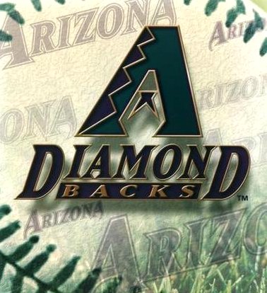
However, in today's market-driven sports society, the team name and uniform design is all about sales. Ticket sales. Merchandise sales. I'll bet anything that the name "Diamondbacks" was focus grouped and tested for a year before the team was officially given that name. But, from a purist position, they didn't need to do that. They already had a minor league team with a dynamite name and logo.
"Good evening, Ladies and Gentlemen, welcome to Bank One Ballpark, home of your Phoenix Firebirds." How perfect would that have been? "Phoenix" was the mythical bird that rose from its own ashes to fly again. Phoenix is a very hot place, so the "Firebird" concept was great. The colors were red and yellow, the colors of fire and heat.

The Firebirds Logo, circa 1996
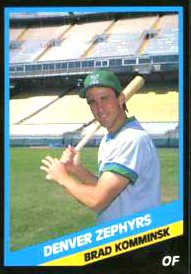
The minor league franchise In Phoenix had been the AAA team for the San Francisco Giants almost since the Giants moved west in 1958. By the late 1980s, the expansion drums began to beat within major league baseball, and several cities changed their names to either sound more professional or to stop using an existing team name. The Denver Bears thought that their name was too close to the "Cubs," and changed their name to the Zephyrs, a name rich in baseball tradition. Phoenix, called the "Giants" in honor of their parent team, changed their name to "Firebirds." I'm sure that most people in Phoenix thought that if they ever got a major league team, Phoenix would continue with that the Firebirds name and logo.
That wasn't meant to be. The team settled on the "Diamondbacks" name, and made things worse with those awful uniforms. Baseball had long ago ended the practice of wearing softball uniforms on the field, and most expected a somewhat traditional style. Thanks focus groups.
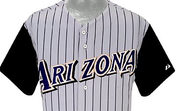
Was this the ugliest uniform ever? Hard to say. I've never like pin stripes on a road uniform, and the lettering looks like they were drawn by a graphic artist who had his license revoked for drinking too much. This one is a little less ugly but still pretty awful. And don't get me started about the "D" made out of a snake. How little league is that? Now this one is least ugliest of them all. Because there is so little on the uniform, there is much less to complain about. Except the logo, that is.
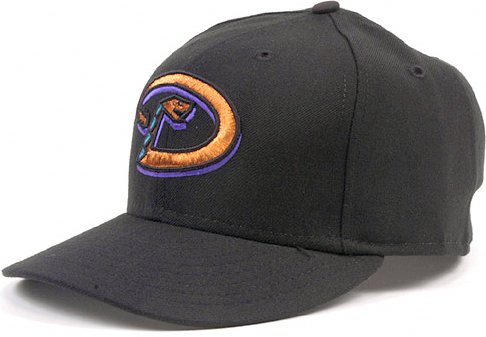
Here we go again with that bent snake thing. Think of all of the "classic" hat logos in the majors right now: Boston - New York - Chicago - Los Angeles - San Francisco, and [of course] Washington. The D-Backs, however, decided to go in a "different" direction: ugly.
Looking terrible on the field doesn't mean a thing. The Diamondbacks have won a championship wearing those horrid togs, compared to the Cubs, who while stylin', havent done diddly since the Wilson Administration.
Oh Well. C'mon Nats. Kill the bums.
# posted by Farid Rushdi @ 6:51 PM 
![]()


