It's So Unbelievable, It HAS To Be True
d
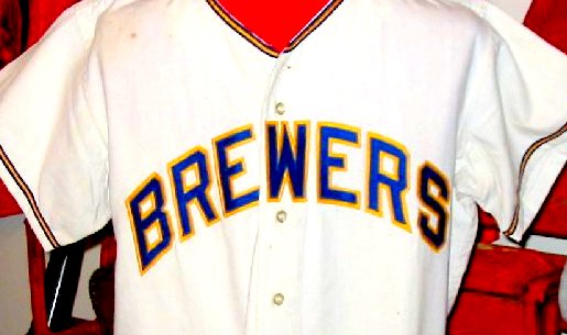
This is a photograph of the original Milwaukee Brewers uniform in 1970. Here is the powder blue road jersey. Notice how different the letters are between the two uniforms? Notice how the road jersey uses a combination of uppercase and lowercase letters? You wouldn't believe why.
Baseball was a losing proposition in Seattle in 1969. Too many owners and not enough assets. A stadium that was barely adequate for the Pacific Coast League the year before. Promised renovations were stopped by the city. All of these negatives caused the team to slip into receivership during the winter. The city was looking for new owners to keep the team in Seattle while a group in Milwaukee lead by Bud Selig was trying to move the team to the Midwest. During Spring Training, lawsuits were working their way through the courts. When the time came to move north, nothing was decided. The trucks were packed with the Pilots gear, and the drivers were given this admonition: "Drive to Salt Lake City and call us." When the call came, the judge had made his decision: they were now the Milwaukee Brewers.
The team had literally just a couple of days to create a new team to play in a stadium that hadn't seen baseball on a regular basis in almost 15 years. The first problem: Where could they come up with uniforms by opening day?
The Brewer management gathered seamstresses who removed the lettering from the uniforms. New, simple block letters were purchased and sewn onto the old jerseys. If you looked closely, you could still see the holes in the material where the old stitches were. They now had home uniforms. What about those powder blue togs?
Always trying to save money, Bud Selig came up with a great idea. He would use some of the letters from the "Seattle" on the road uniform: the two "e's" and the "s" would work. The team bought letters for the B-R-W-R part of the lettering, and used the "e's" and "s" from Seattle. But no one noticed that the Seattle uniform was unique in 1969: they used lower case lettering. So when the Brewers went on their first road trip, they sported uniforms with both upper case and lower case lettering across the chest. They also left on the exaggerated nautical striping, or hacks, on the sleeves. What did these stripes have to do with Milwaukee? Nothing. They just didn't have the time to remove them.
By 1971, they created some uniforms from scratch, although they still looked a bit like the ones that came from Seattle the previous year.
And we thought that the Expos move to D.C. was problematic. Hah!
# posted by Farid Rushdi @ 2:53 PM 
![]()


