Primary Colors
 [February 25th] - There are a lot of "heavy" stories to consider this Saturday morning. Will Alfonso Soriano play in the outfield? Will he stay with the Nationals? Is Jose Vidro's knee healthy [finally]? Will Ryan Zimmerman be able to start this season the way he left off in 2005? These are all very important.
Forget all that. Let's talk about something fun.
Overall, I was very happy with the Nationals' uniforms last year. They kept the "curly W" as a tip-of-the-cap to the city's baseball fans from a generation ago [that's me, and I do appreciate it]. The overall cut and color of the game day uniforms, both home and away were very sharp. I've never liked the way the "WASHINGTON" and "NATIONALS" lettering on the jerseys starts off large, becomes smaller and then gets big again. Perhaps the designer did that to better fit the large number of letters onto that small space [By the way, did you know that an employee of Major League Baseball designed the team's new uniforms while sitting in a motel room in Boston watching the 2004 World Series? Graphics were his hobby, and Bud Selig, afraid the league was running out of time, told his employee to "get it done" that night]. But other than that, I've been very happy with the way the looks on the field.
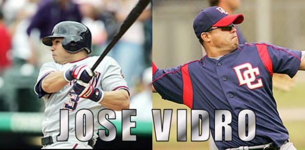
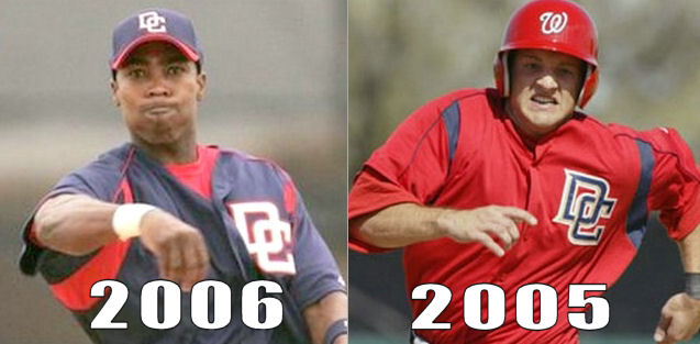
The red batting practice jersey was also a stunner. I loved the way the interlocking "DC" stood out on the bright red background. The gold piping was very obvious, even from a distance. However, those have been replaced by the new, all blue "bp" jersey. It's just, well, too "blah." The first images out of Viera indicate that the jersey doesn't photograph well.
[Ed. note: After 30 years as a professional photographer, I know all too well that dark material absorbs light and can screw up a camera's light meter, making photos of the Nats' new jersey looks muddy and without texture] The gold in the 'DC' logo is barely noticeable.
I don't like it.
I guess the good news is that, once spring training is over, we'll hardly ever see it. Unlike last season, when the team wore the batting practice jersey in a game, the Nationals now have an "alternate" team jersey which is, thankfully, red and very similar to last year's "bp" jersey.
Ok. I'm done. Thanks for listening to my rant.
FWIW, it seems to me that the new blue ones were designed to replace the red ones precisely because the red ones had been SO popular, the team wanted to use them as an alternate jersey during the regular season. They are victims of their own success.
 : 11:24 PM
 << Home
![]()